Choosing Type: Voices, Contrast and Family, Guest Blog by Shala Graham
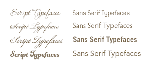
As you can see, not all scripts or sans serifs have the same voice.
Guest Blog by Shala Graham, Principal and Creative Director, SW Creatives
As a designer, my love for typefaces has grown over the years. I find myself watching movie titles or credits and thinking, “Nice type choice,” or “That type is so simple, but strong!” Or as I get email newsletters from some of my favorite type distributors announcing an amazing type family on sale for just $39 to the first 400 people, I get all excited and immediately check it out to see if it is worthy of our growing type collection! I know, I’m revealing my inner design nerd, but bear with me as we see how typefaces can be chosen and paired.
EXAM THE VOICE
Each typeface has its own voice or character, even within the same genre or style of type, such as scripts. Some feel commanding and bold, others warm and approachable, or very formal and chic. It is important that you choose a typeface that is appropriate for your brand. Just as we choose color based on associations or meanings, typefaces should be chosen with the same strategy or thought. Because typefaces have their own voice, you want to make sure that it is speaking the right message.
LOOK FOR CONTRAST
As the old saying goes, opposites do attract, but not every opposite is the right fit. The same is true with type. I love pairing a sans serif typeface with a serif or a script. In the process of logo development or layouts, I rely heavily on my type choices to bring forth the various emotions that a brand should elicit, instead of expecting imagery or a single mark to tell the whole story. This takes some exploration, or trial and error, to get the combinations just right. As you mix and match, sometimes you’ll have that peanut butter to my jelly feeling, and other times you’ll get a sardine and ham sandwich (yuck)! Check out this tutorial for more on pairing fonts.
Thirsty Rough is paired with Museo Sans (left) and Avenir with Chaparral Pro (right), creating interesting combinations.
DON’T NEGLECT THE REST OF THE FAMILY
My favorite typefaces to buy are the ones that come with a large font family, which means there are many variations, such as light, condensed, regular, semibold, bold and their italic counterparts. This produces a powerhouse font family with flexibility and expression, allowing me to design an entire annual report, brochure, or website with the flair and consistency of a single family. I guess it’s like a real family…each child is different, but they look good together in the family photo!
Arno Pro (left) and Myriad Pro (right) are two of my favorite large font families.
Thank you for sharing in my design nerd fun! Tweet us your #typecreations at @swcreatives!
Have you found this blog to be useful? Share your thoughts with Maryland Nonprofits, connect with us on
Facebook
,
Twitter
,
LinkedIn
, and
Google+
![]() Spring forward with a new career this season, follow @MDNonprofitJobs
Spring forward with a new career this season, follow @MDNonprofitJobs